
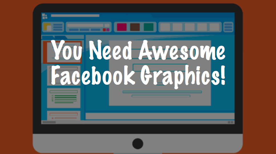
Facebook is our happy, never-changing friend, right? We wish. Thanks to Facebook’s tweaking and algorithm changing, many pages are struggling to get attention. It’s hard to keep up with all of the changes, but there is one thing that can get you noticed: Graphics.
Designing a graphic for an article or as a promotion for your page can be the best thing that you can do to gain traffic. The right graphic can draw interest, intrigue, and maybe even a smile. Is it hard to make? It depends. Some of us are techier than others, and yes, that can matter when coming up with a graphic. But, with a little tenacity and time, you can graphics that help build your fan base.
Tip #1: The More Recognizable, The Better
If you have a page about Canadian TV, having graphics featuring Yannick Bisson from “Murdoch Mysteries” would be great. For a US audience, maybe not so much. To draw attention, you need to use images that are recognizable to your audience. Memes like this are great because they allow the viewer to understand the product or purpose without spending too much time doing so. We all love instant gratification – and using a recognizable image can do just that.

To those in the know, Detectives Murdoch and Watts. For those not in the know… two winos in period clothing.
Likewise, an unfamiliar image – or an image that has nothing to do with the product – can potentially cause harm (see tip #5 below). If you don’t, or can’t, use a recognizable image in your graphic, use bright, contrasting colors.
And that leads up to…
Tip #2: The Right (or Wrong) Colors Can Make (or Break) a Graphic
What’s your favorite color? Do you use it often in your graphics? I love blue, but since Facebook’s background is blue, that does me zero good when making Facebook graphics. It will just fade into the background, and all of my time and effort is wasted.
Instead, study color charts. Use highly contrasting colors and designs to get attention. Make your graphics tacky and noticeable.
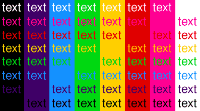
See how the brighter colors look amazing with the black background? Studies have shown that a darker background – with the right contrasting colors – does wonders for a Facebook graphic. Try it – and be amazed at how well your graphics perform.
Likewise, bright colors work too. Just make sure that the colors contrast nicely (like the above graphic), because colors that are too similar fade together and cause confusion. No one wants to struggle to read a graphic.
Tip #3: Graphics Rule
Do you need to use a recognizable character for every single graphic? Absolutely not – in fact, it’s good to mix it up. Another graphic type that does well in studies is the graphic that contains a chart. We all love visualization, and reading a chart versus reading the written outcome is preferred by nearly every living humanoid (my sarcasm here – not an actual fact).

You don’t have to use such a color-saturated graph – simple graphs work too. Try it out on your page. See what works. Line graphs, pie graphs, scatter graphs… try a few out, and see what gets the best response.
Tip #4: Use GREAT Graphics!
If you have scrolled social media today, you have came across many graphics. Think of the most memorable: Good coloring, clear, crisp, sharp. You need – heck, you must have clear graphics. Crystal freaking clear graphics. A fuzzy image doesn’t look professional. Generic images that are used over and over don’t look professional. Use PowerPoint to create awesome graphics – it’s easy and there are hundreds of tutorials online.
Don’t fall into the meme trap of reusing someone else’s graphics. Use your own. Be original. Be clear. Be awesome.
Tip #5: Rep Your Product – and Rep it Well
Regardless of how cool and clear and catchy your graphics are, if they do not correlate with your content, you’re screwed. You must have relevant graphics! This is a huge reason why some of your generic graphics and memes aren’t doing well. You need on-topic, fresh, relevant content. It isn’t hard to do, and by using Canva or PowerPoint, you can save a template and reuse it – albeit with new photos and colors.
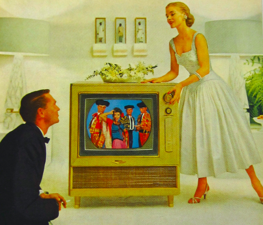
What are they trying to sell? A TV, of course.
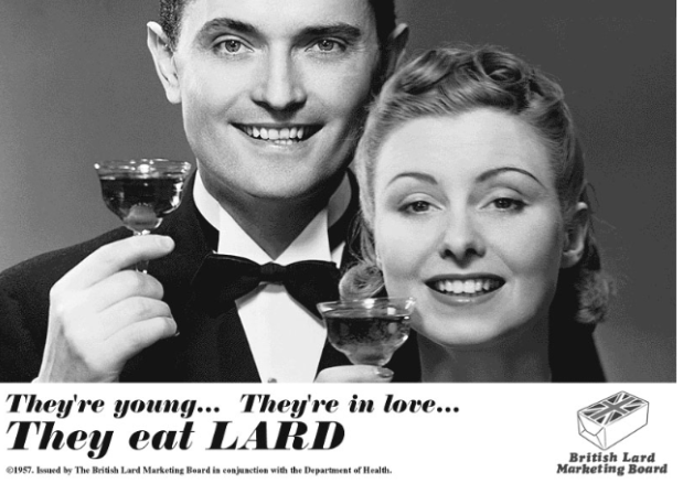
Where’s the lard? Nowhere. This ad is confusing, even though “lard” is in all caps.
If your words and your graphics do not correlate, you have another problem. The young lard-lovers above could really love their lard, but the ad doesn’t show it. They look happy(ish), but what are the selling?
Let’s try it again without the wording:

What are these two trying to sell? Toothpaste? Wine? Sparkling cider? Without the words, we haven’t a clue. With the words, it’s still iffy, because the image doesn’t have anything to do with the subject: LARD.
Tip #6: Use “Actionable” Phrases
One of the best things that anyone can do when making a graphic is adding an “actionable” phrase. Actionable phrases can range from:
- Click here to learn more!
- Message us for more info!
- Let us know in the comments!
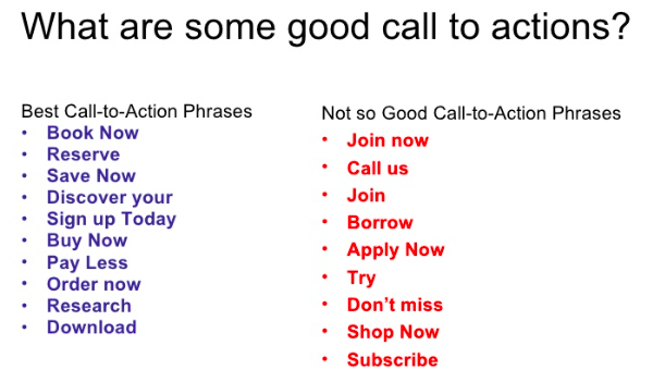
The more contact you get from your audience, the better. You not only show up more often in their Facebook feed, but you will show up more often on all of your audiences Facebook feeds. The more contact, comments, likes, share, the more organic traffic your graphic will garner.
Sometimes people need that not-so-subtle nudge to go through with the action. Don’t be afraid to ask them to do something.
So, what now?
Get to work! Or better yet – start playing around with PowerPoint, Canva, or whatever your favorite graphics program is. There is nothing wrong with playing around with graphics until you get it right; few of us master it on the first try. Try out different graphics, and see what works best with your audience. We all know there is no harm in trying, and if you don’t try, you’ll never know the results.

Latest posts by Heidi Stephens (see all)
- Six Tips To Help You Design The Best Possible Facebook Graphics - April 17, 2018
- 5 Reasons You Need a Content Writer - April 10, 2018
- The Latest Facebook™ Hacks: The Security Breach 101 - April 4, 2018